My Blog List

Monday, February 28, 2011

100 uncomfortable things list

1)hearing someone pee
2)being in front of people
3)being put on the spot
4)hearing someone having sex
5)seeing a couple make out
6)watching someone pelvic thrust.. as a dance move..
7)hearing someone try to cover their peeing with the faucet
8)seeing peoples feet under dressing room stalls
9)sweet talk in public
10)being too touchy feely in public with a boyfriend
11)having a girl grab my ass in public
12)having my ass grabbed in public.
13)talking with someone who has something in their nose like a bugger
14)talking with someone who spits while talking
15)having someone looking at your non-existent breasts instead of your face in a convo
16) having someone cat call you while you are walking
17)being checked out by really old men
18)seeing someone get hurt
19)seeing someone almost get hurt
20)watching a wreck
21)almost getting into a wreck
22)seeing someone almost get into a wreck
23)being around an ex that was left on bad terms
24)being around an ex and his new girl after a week of being broke up
25)being around an ex with your new man
26)being around your man's ex
27)being in the same room with two people you've slept with
28)seeing a sex scene in a movie with your parents
29)seeing a sex scene in a movie on a first date
30)seeing a sex scene in a movie with your grandparents

Thursday, February 24, 2011

Other Ideas for Cardboard...

My boyfriend was inspired by my use of cardboard and decided to start his own project......


a kitty fort for his furry friend Zeek!

Modular Madness Critique


My piece did not turn out the way I wanted. I did not realize how long it would take me to melt the crayons to the box. I spent around 20 hours on this project...

I critiqued my art work myself i think some things that would improve the piece are standing it straight up, making it a "wow" in craft(No Drips!), and making a nicer base.

For the presentation of my work I chose to talk about Process/Ambitious, Materials, and Form. I decided in the beginning that I would strip the crayons of their paper and melt them to create my piece. I think that crayons are  an ambitious object in general, it was very difficult to work with. My material was very messy and kind of difficult to work with. I couldn't control exactly where the melted crayon went! Another thing that was kind of difficult was the fragility of the melted crayon after it melted. I feel like the if it was not made out of crayon the process the difficulties and the outcome would be COMPLETELY different. So no it could not be made from a different object just as well, I used something that were characteristic of a crayon to make the piece. Which leads to form I used color, shape and texture. In this piece I used complementary, warm and cool color patterns along with some color scales. I chose some geometric shapes to show the shape of the understructure off. I was inspired to do geometric shapes  by Larry Bell's piece L.Bell's House III(Death Hollow). The piece had a unique texture. I wish i could have played it up more by carving into the natural melting patterns. I melted the crayons with the end of an old glue gun it gave it very nice textures.

Sunday, February 20, 2011

Lines..


An observed line...lines are everywhere they are on our plates of food, our clothing, and our roads. We are forced to stay in line everyday. The screaming lines of unspoken social law.

I too stayed up all night, I too heard the thunderous silence of expected conformity, I too went to break down the gates, I saw the first angels fly. I died. I was resurrected. I awoke not in the light but in the comfort of the night. I too had left all good sense behind me; it was time to break away. It was time to breach the absurd and the unthinkable! I was there among them and now I am here. I too heard the call to break down the  screaming walls of the unspoken... and I too will be heard.


Thursday, February 17, 2011

Modular Madness playdate


CRAYONS-- I am going to make a waterfall of naked crayons. I made them naked so it would be easier to bind then together. I plan to melt them together and use cardboard as an understructure.

Tuesday, February 15, 2011

Human Compositions 1.3 "]

Man was this a fun one.
Step one: we chose dots instead of squares
Step two: 
1.Ideas for white space--1) milk                               6) Painted body parts
                                        2) sheets                            7) projection screen
                                        3) paper on the floor          8) white metal building
                                        4) night time background    9) snow
                                        5) painted hands               10) white sand
we decided on painted white hands
2.Ideas for blackdots--1) shadows                          6) painted bottle caps
                                     2) spot lights/flashlights         7) paint     
                                     3) bouncy balls                    8) bullet holes
                                     4) black olives                     9) painted black faces
                                     5) paper                             10) black spanex bodies
we decided on painted assorted foam balls and pom poms
3.Make uniquely human-- 1) Paint hands and place black balls on the hands in patterns of dots
                                           2) Stand outside at night holding flashlights at different distances to create
                                               different sized dots.
                                          3) Wear all white against a white background and blow up black ballons
                                          4) Pool filled with milk and us in black to represent the dots.
                                          5)  make a huge bubble foam square and paint our heads black then poke them                                              through the foam.
Step three: we chose to do the first idea on the number 3 in step two.


We critiqued ourselves. 
3 for craftsmanship because the pictures were not all the same, because of missing members. Also there were     
   white smudges on our white dots.
4 for use of white space. we really like the white hands we felt like they went well with our theme.
4 for dots the texture of the dot were nice and went with our theme but they had white marks on them.
5 for the human element because the human element was minimal and not a lot of people did just one body 
   part like we did.
4 for group process because everyone worked very well together, there were no fights and we were one of 
   the first groups done. 
some things not covered above:
theme Our theme was texture and intimacy with the hands. Everything is done with the hands and we touched hands for almost an hour.
Selection and Revision After we were done with taking the pictures we selected 2 from the multiple shots of each compositions. Then everyone's two were sent to them it was then left to the individual to print their own pictures

Wall Box Critiques...

I know I have said this plenty of times but I really enjoyed the collage and I enjoyed looking at everyones ideas. There were a few I really liked.
Jakie- I loved the levels they created an optical illusion feel
Danielle- The colors were great and the levels were very nice as well
Zack- My Favorite. I liked how it was cut in half by what looked to me like a body of water craftmenship was great just a nice piece to look at.


Monday, February 14, 2011

The Menil

I really enjoyed myself at the Menil Collection. The main gallery was nice. I liked the Kissed By Angels room and the Surreal Witnesses room. I didn't understand the work in the CY Twombly Gallery. However I did like one piece in the gallery, art in 9 pieces or something like that. There was nice movement in the brush strokes kind of like Van Gogh. The Dan Flavin installation was neat. I can't believe it has been there almost 11years though. I bet it was even neater when it first came out..it has kinda lost its shine...ha. Some other artists in the museum I liked were Max Ernst, Joseph Cornell, and Rene Magritte.

Sunday, February 13, 2011

Repetition/Rhythm and White/Negative space..


Repetition 

Rhythm

Rhythm

Rhythm

Repetition

Wall box

My wall collage box. It is mountains and at the peak there is about an inch of cut not melted gluestick. I really enjoy collage I just wish we would have had more time so I would have been able to create more depth to the mountains.

Squares not dots!

Photo of my Squares. Two were not very clean and I got a hot pink post it for bad craft but the rest were good. I didn't use any of these for the collages.

Thursday, February 10, 2011

Artists and their work

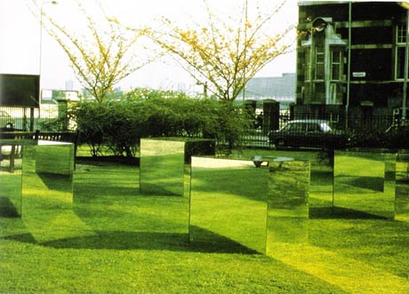
John McCracken is the artist I chose for Minimalism. As I was looking up different artists for this category the mirrored cubes caught my eye. I love the green grass reflected off the cube. The reflection of grass and reflected light is really neat to me, all the different reflections really create a neat piece of art work.


Christine Corday is one the artists i chose for Postminimalism. I posted this picture because the lighting is amazing and the space the piece was put in complements it very well. I like the roughness of the area as well I think the placement of the light is important to this piece. Tom Friedman is the other artist I chose for Postminimalism. I chose him because there is a lot going on in his work, and I like the quirky gore.


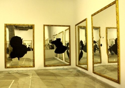
Michelangelo Pistoletto is the artist I chose for Arte Povera. I picked him from the rest because I like his use of mirrors and how they reflect the viewer in the artwork. 


Chris Drury is the artist I chose for Process Art. I chose him because I really love the way he creates art with things that come from the earth and how they flow and fit with the natural world.

Thursday, February 3, 2011

lecture #2

sketches from reading and lecture.

collage is time consuming...

Second part of our next project was creating natural rhythm that goes with our circles using collage. The studies of topographic and magnetic field maps helped. I enjoy collage but it is insanely time consuming.

Larger than life proposal failed

My tutu is coming along nicely. There was a lot of rough detail in my object I am hoping my tutu is not too rough looking.. well my final piece is not up but it turned into a hunch back/backpack..

Larger than life proposals/ ideas/ object


The project of spheres lead to our current project, making a cardboard object that can be put on your body. I am creating a tutu, my object was the top of an acorn...not a normal acorn either.